
You might think a sign up or purchase button might just be a small thing but from what I've seen these past two weeks, they can actually make a huge impact.
For example, Bing made $10 million in additional annual revenue just by tweaking their colors on their links. The Obama campaign in 2008 collected almost 3 million more emails because their button was "Learn more". In some tests, Wikipedia received 3x more donations because they cut the emotional heartstrings they were going for in their calls to action.
After seeing these examples, I decided I was going to review what experiments others are trying with their buttons.
I reviewed 88 signup pages with buttons and dove into what experiments you might be able to run with your own buttons.
How I did this
I reviewed 88 signup pages sourced across LinkedIn, Instagram, BetaList, and Product Hunt.
Each page was coded for the wording of its main button, whether "free" or a price appeared on or near it, any risk reducers next to it and any social proof nearby. Claude helped with the coding, data processing, and built the graphics. I spot-checked the results against the live pages. The writing and the conclusions are mine.
Try "free" on or near the button
Free was not the majority but it was a large percentage of buttons. 39 of 88 buttons (44%) had free on or beside them.
There weren't many buttons we looked at that showed a price near the button, but 9% (8 of 88) did. Within those 8, 2 of them had the price directly in the button. I could totally see that helping conversion for products that are low cost.
Either way, it might be worth trying "free" in your button or in the nearby copy.
Add a risk reducer near your button
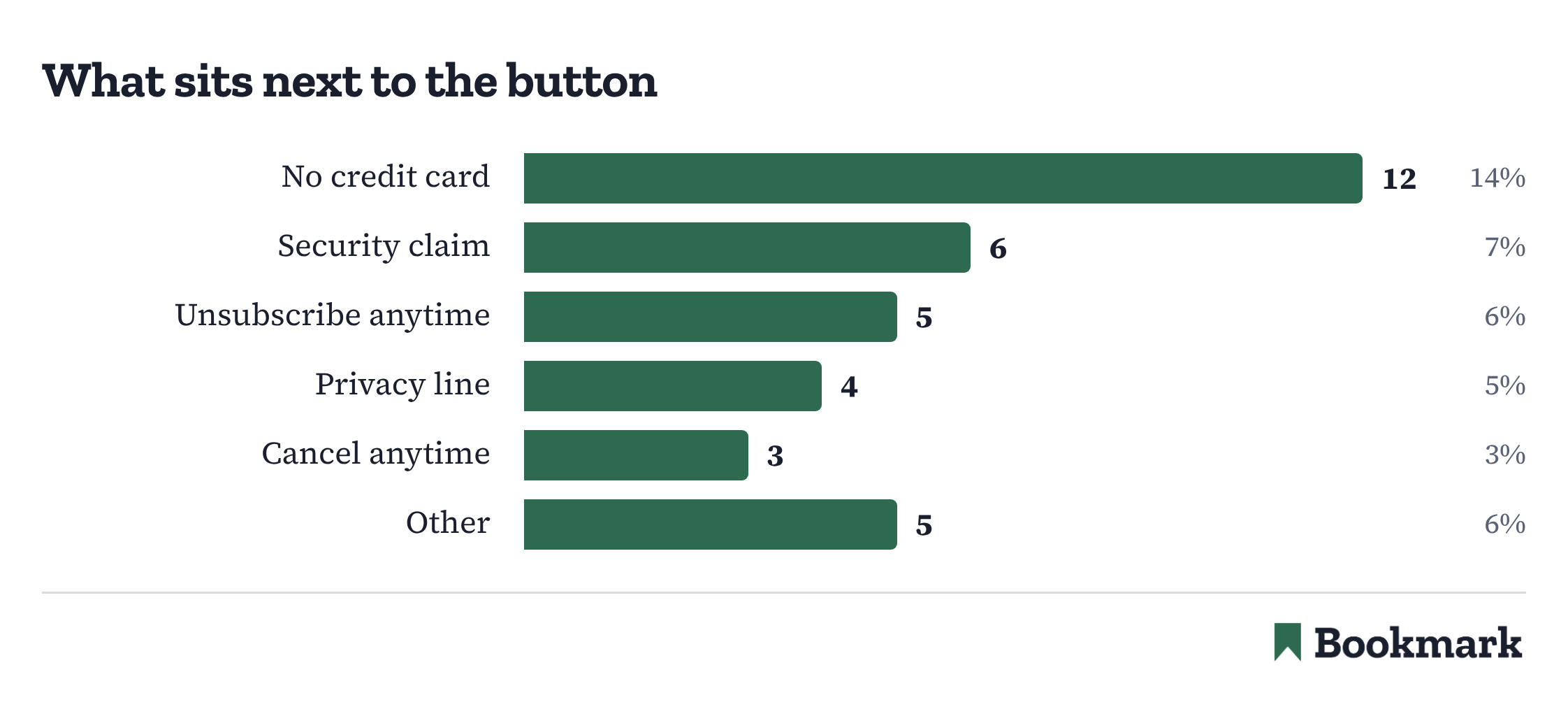
Especially if you're a new company or creator, this is a great experiment to run.
Add a risk reducer near your buttons. What I mean by that is use "no credit card needed", "cancel anytime", or "Unsubscribe anytime" to whatever you want your potential customer to sign up for.
Sure, it might not mean much to some but for some, it might subconsciously give them enough comfort to give you a trial to your product or to signup to your email list.
26 of 88 pages (30%) have some sort of risk reducer next to the button. With it being that many, I would guess this is working decently well.
There's a few different ways to test social proof
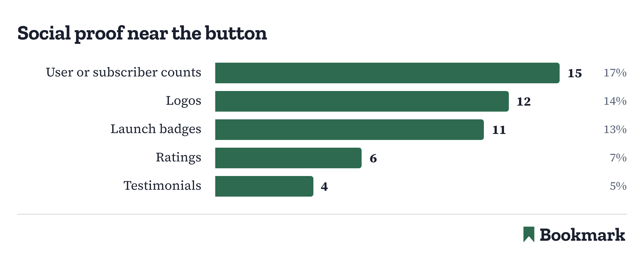
There's no one way to show social proof that your offer is real. You can use logos, user counts, ratings, or some sort of launch badge like a "#1 Product of the Day".
It was a mixed data set from what I pulled. Here's the breakdown of how much each was used:
- Logos: 12 of 88 (14%)
- User and Subscriber Counts: 15 of 88 (17%)
- Ratings: 6 of 88 (7%)
- Launch Badges: 11 of 88 (13%)
Note: these stats are slightly skewed because of me using Product Hunt for research and if you're using Product Hunt, you're naturally going to use their badge if your product does well there.
All in all, you should test some sort of social proof. 41% (36 of 88) of these pages had some sort of social proof next to the button.
Name the action, the thing or the outcome
Personally, I just assume my buttons will be something like "Subscribe", "Read more" or something like that.
This data made me think that I should be experimenting a little more with the actual words on the button, especially as "Subscribe" was only 3 of 88 buttons.
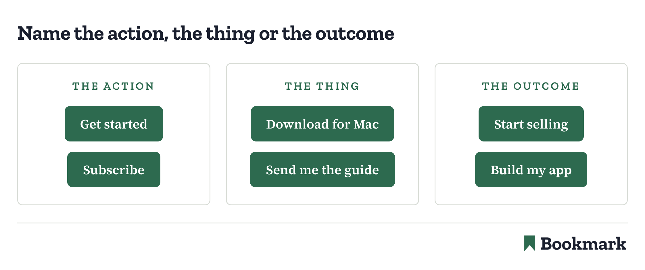
There were three different categories of buttons:
- Action: "Get started", "Subscribe"
- Thing: "Download for Mac", "Send me the guide"
- Outcome: "Start selling", "Build my app"
Here's the breakdown of usage of these three:
- Action: 58 of 88 (66%)
- Thing: 21 of 88 (24%)
- Outcome: 8 of 88 (9%)
I know name the outcome isn't the most used in this data set, but I do think name the outcome could do more good than bad. I would consider that more heavily in experiments.
Button length
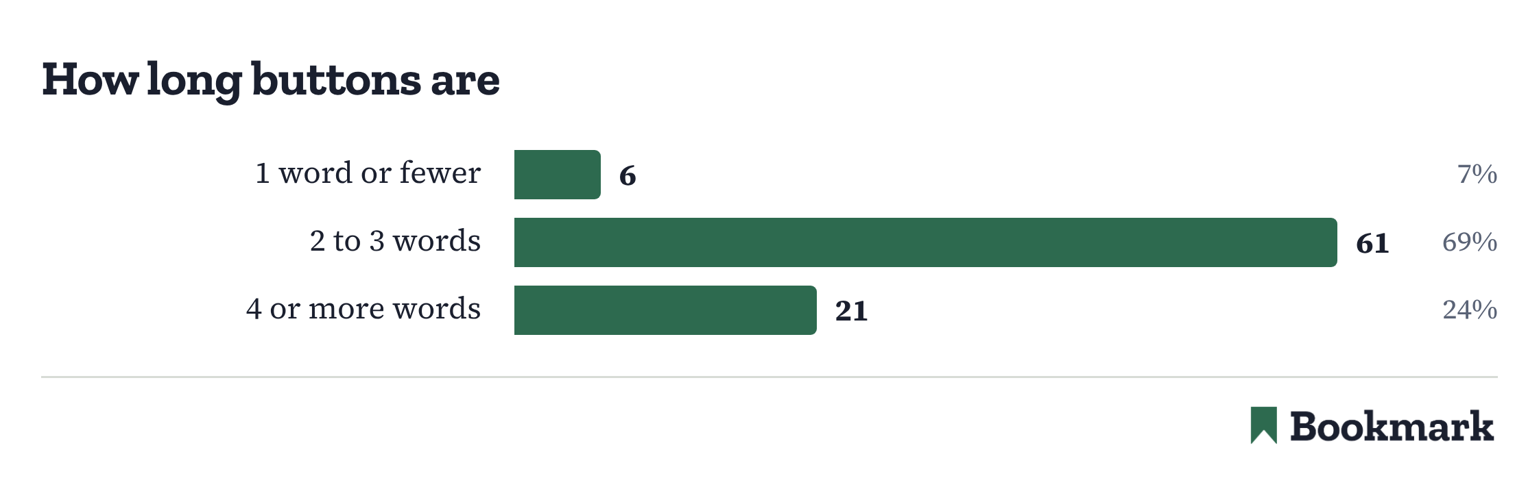
This data was interesting to see. I don't think I've personally ever used 4 or more words on a button but 24% (21 of 88) of buttons had 4 or more words.
Now, that's not the majority as 69% (61 of 88) of buttons had 2-3 words.
Almost half (9 of 21) of these buttons with 4 or more words had "free" in them though. Examples of this are "Get started for free", "Sign up for Free", or "Create a free account".
But, it's worth seeing if shorter vs longer buttons make any difference in signups or purchases.